InPlace.
Find your fit, before you go.
InPlace is a personalized accessibility and environment-discovery app. It helps people understand what a place will actually feel like, based on their sensory, physical, and environmental needs.
- My role
- Brand design, Creative Director, UX/UI design, prototype
- Platforms
- iOS app
- Scope
- Personalized place discovery, brand direction, and UI design
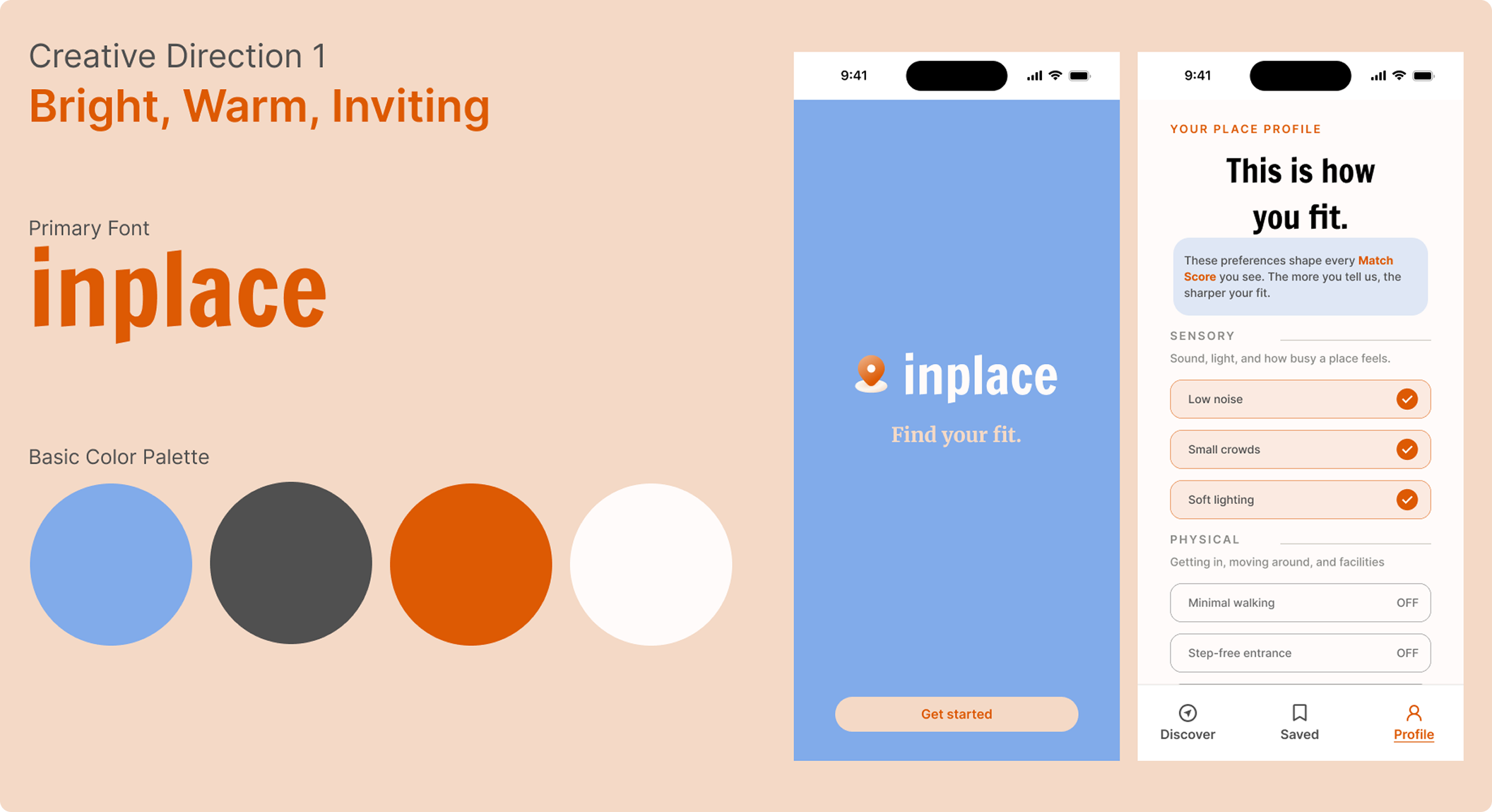
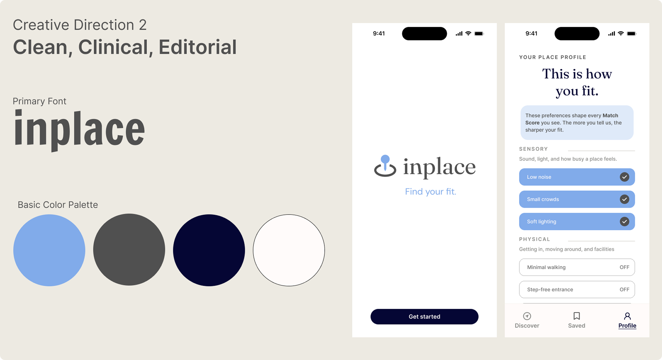
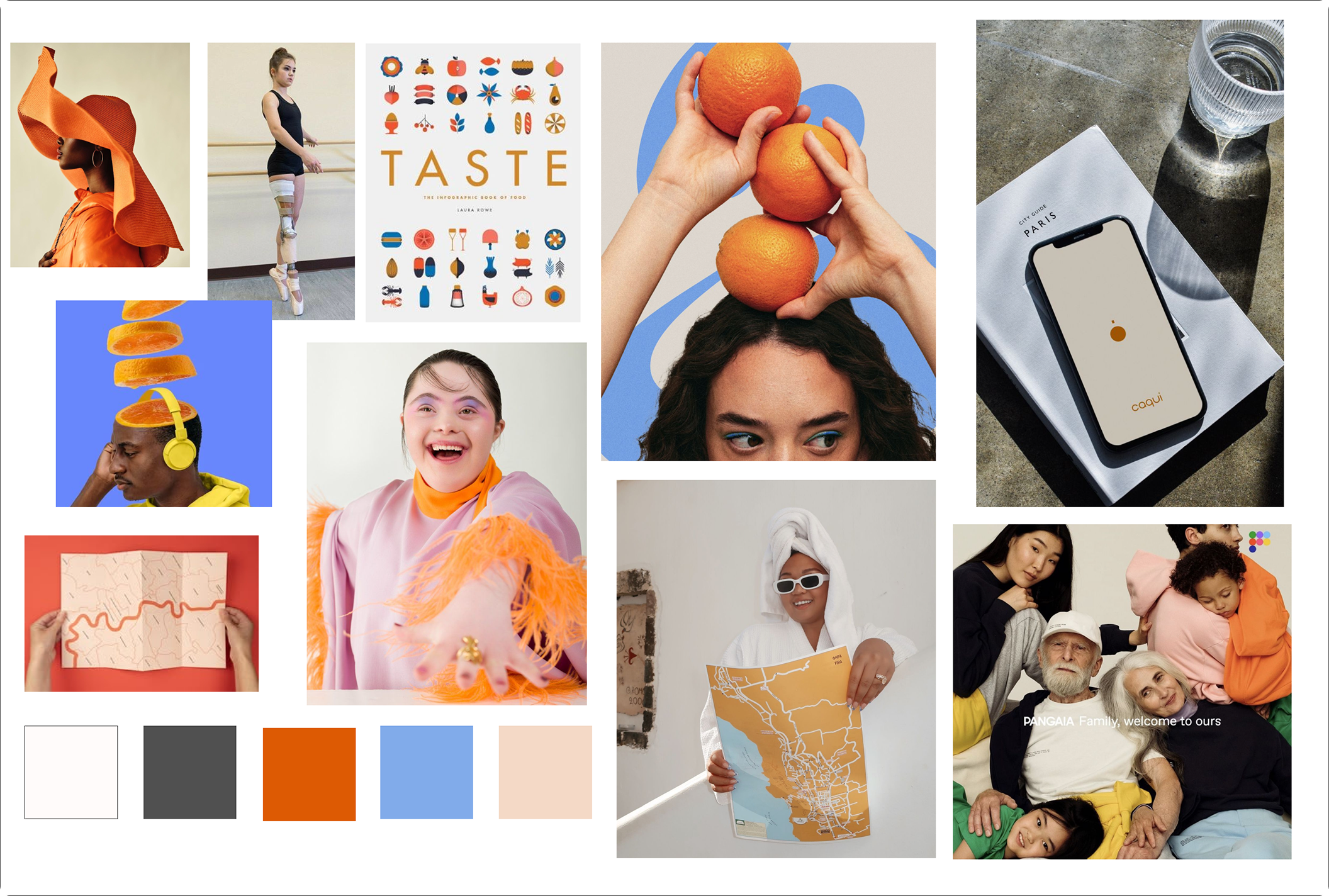
InPlace challenges the conventional clinical aesthetic of accessibility products. I explored two visual directions before choosing a warmer, brighter, more inviting identity that positions accessibility as an everyday consideration rather than a medical accommodation. The result is a consumer-facing experience designed to make users feel welcomed, represented, and empowered.
02 / InPlace
The goal
Help people decide with confidence whether a place is right for them.
Design Brief
Rather than telling you where a place is and how other people rated it, InPlace tells you what it will actually feel like to be there. It considers sensory, physical, and environmental needs beyond a general accessibility checkbox.
The Goal
Give people useful information before they spend the time, money, or emotional energy finding out the hard way. Accessibility isn't one-size-fits-all.
03 / InPlace
Who I designed for
“Accessibility isn’t one-size-fits-all.”
Intended audience
People with sensory, physical, or environmental needs who want to understand a public space before visiting. A personal profile captures preferences such as noise tolerance, lighting sensitivity, crowd comfort, and mobility needs.
04 / InPlace
Key decisions
- Warm, not clinical
Chosen direction: bright, warm, and inviting.
The cooler, more clinical direction signaled precision, but risked reinforcing accessibility as a medical accommodation. The chosen direction treats it as a normal part of everyday life.
- A personal Match Score
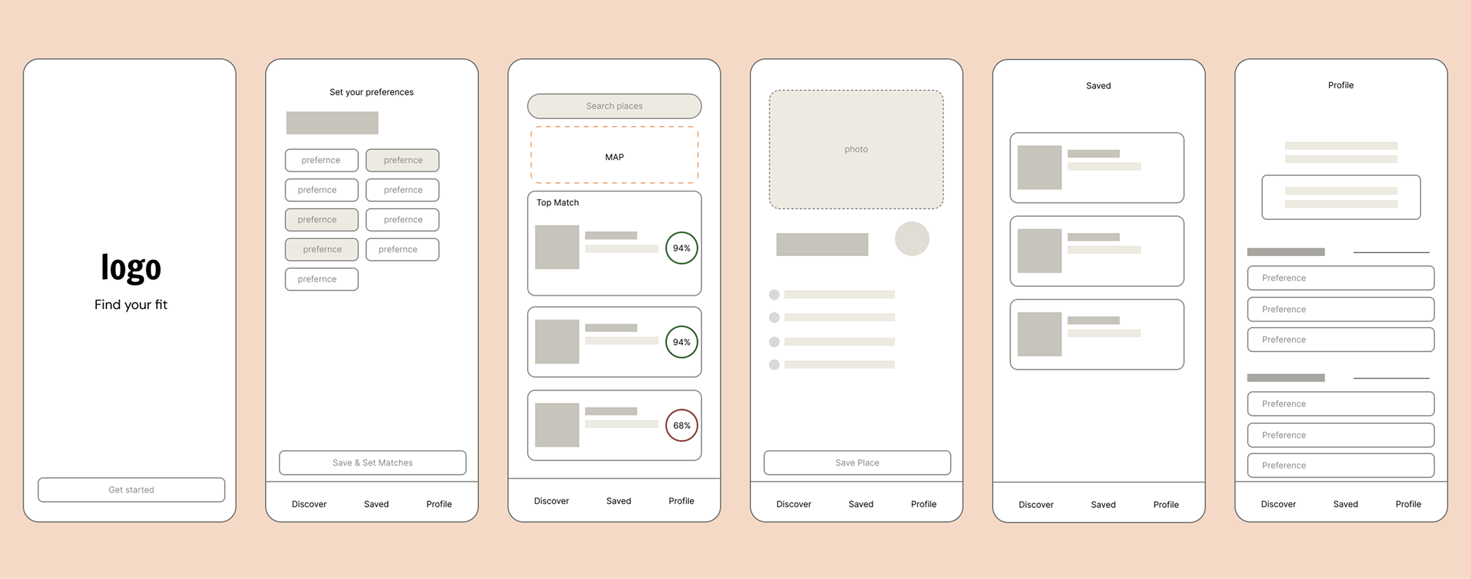
The same café might be a 94% fit for one person and a 68% fit for another. These are illustrative values from the concept, not measured outcomes.
- Seen and welcomed
As someone with special needs, and a parent to children with special needs, my goal is to make accessibility visible and mainstream. The palette, typography, and tone aim to make people feel welcomed, not diagnosed.
05 / InPlace
Lo-fi design
06 / InPlace
UI library
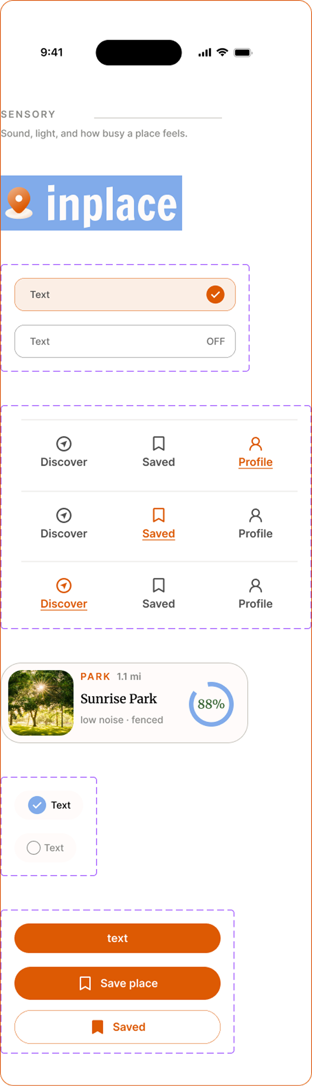
Visual language
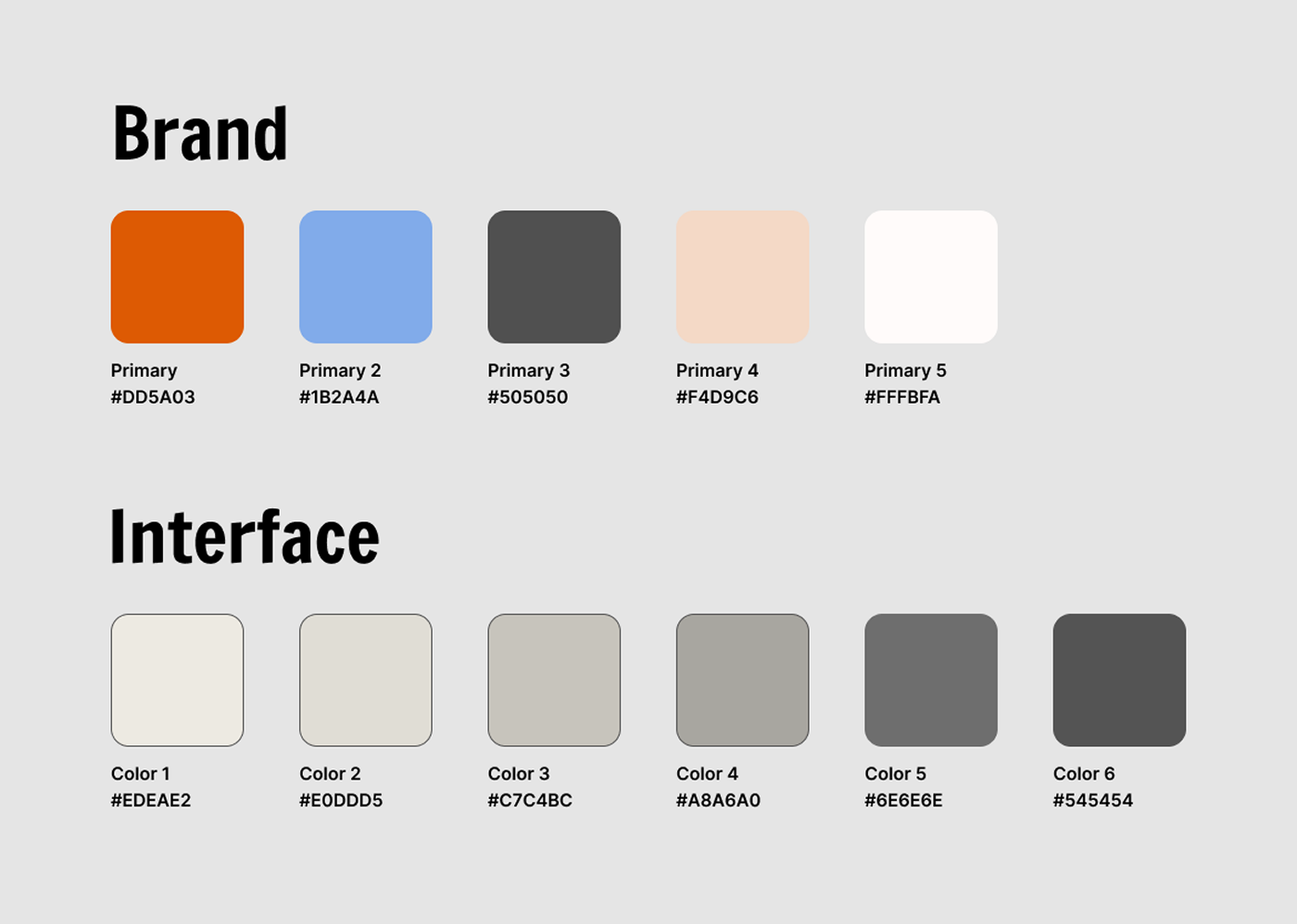
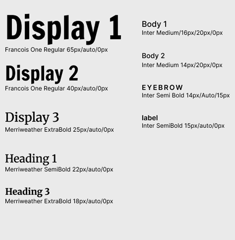
Bright, warm, and inviting. Orange, blue, peach, and off-white support an approachable consumer-app identity. François One, Merriweather, and Inter establish the app's type hierarchy.
07 / InPlace
Hi-fi prototype
Prototype link
Start with your needs
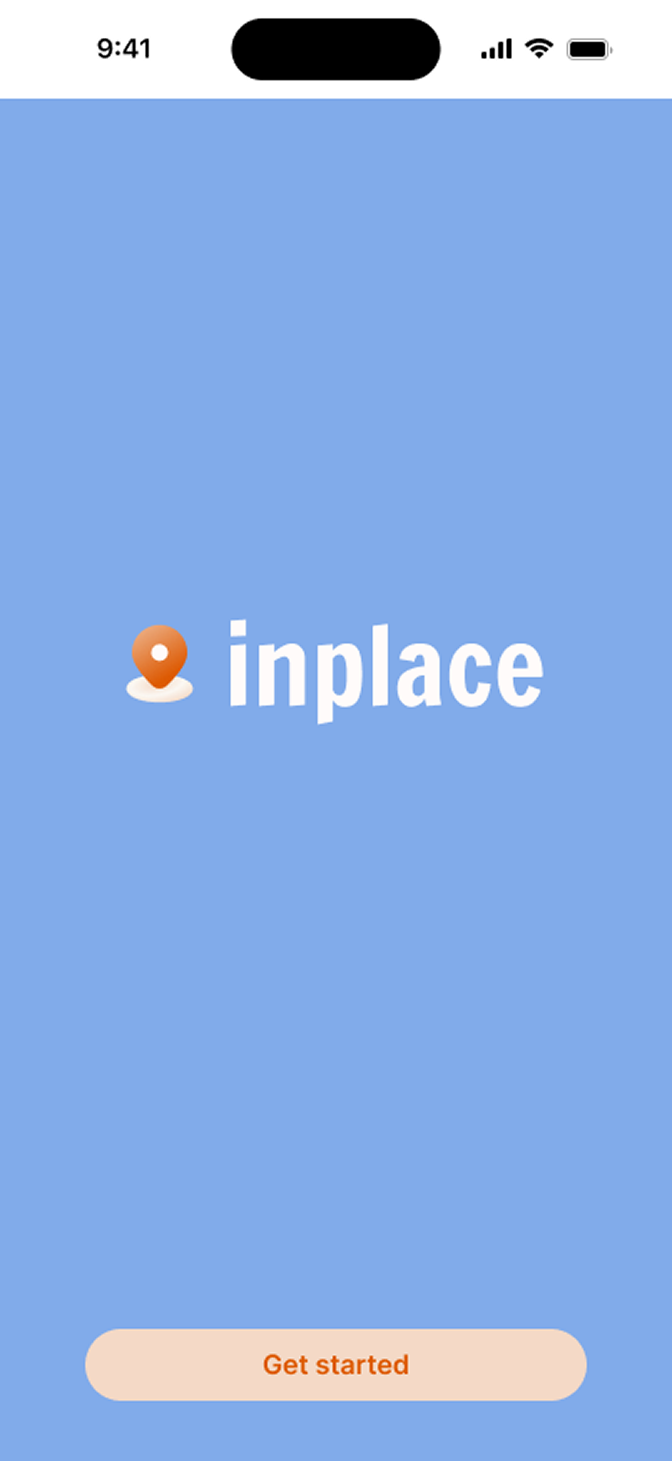
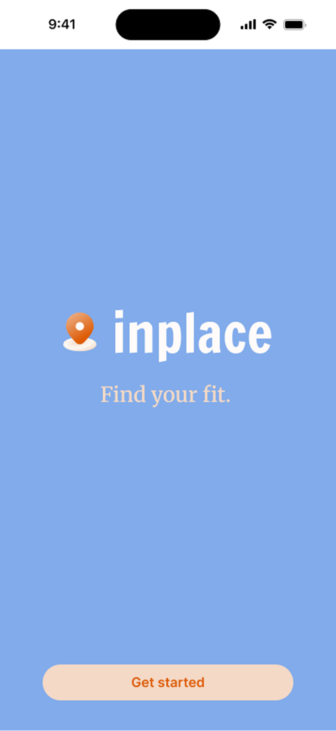
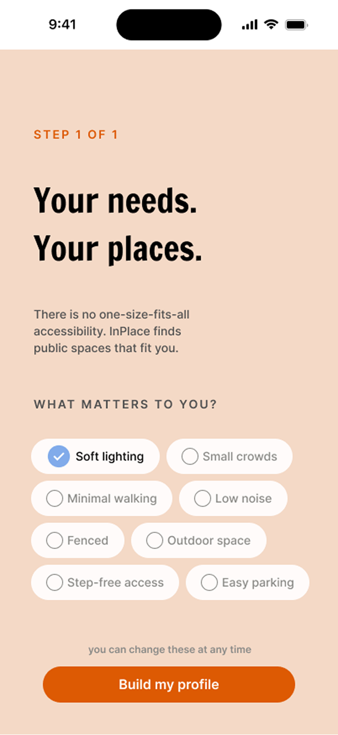
Experience notes
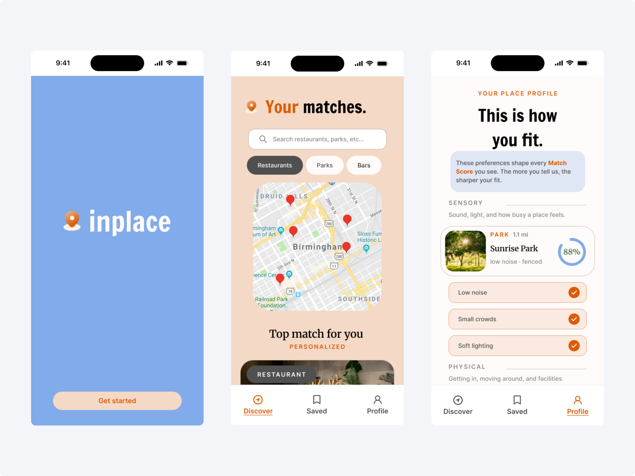
Onboarding and the personal profile establish the sensory, physical, and environmental preferences that inform place matching.
Discover and evaluate
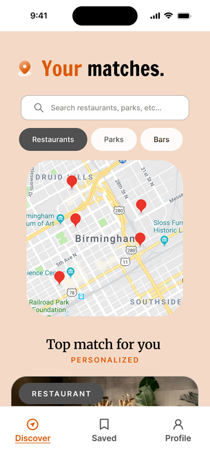
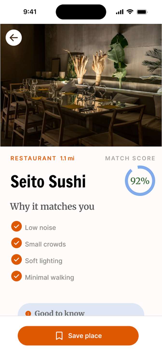
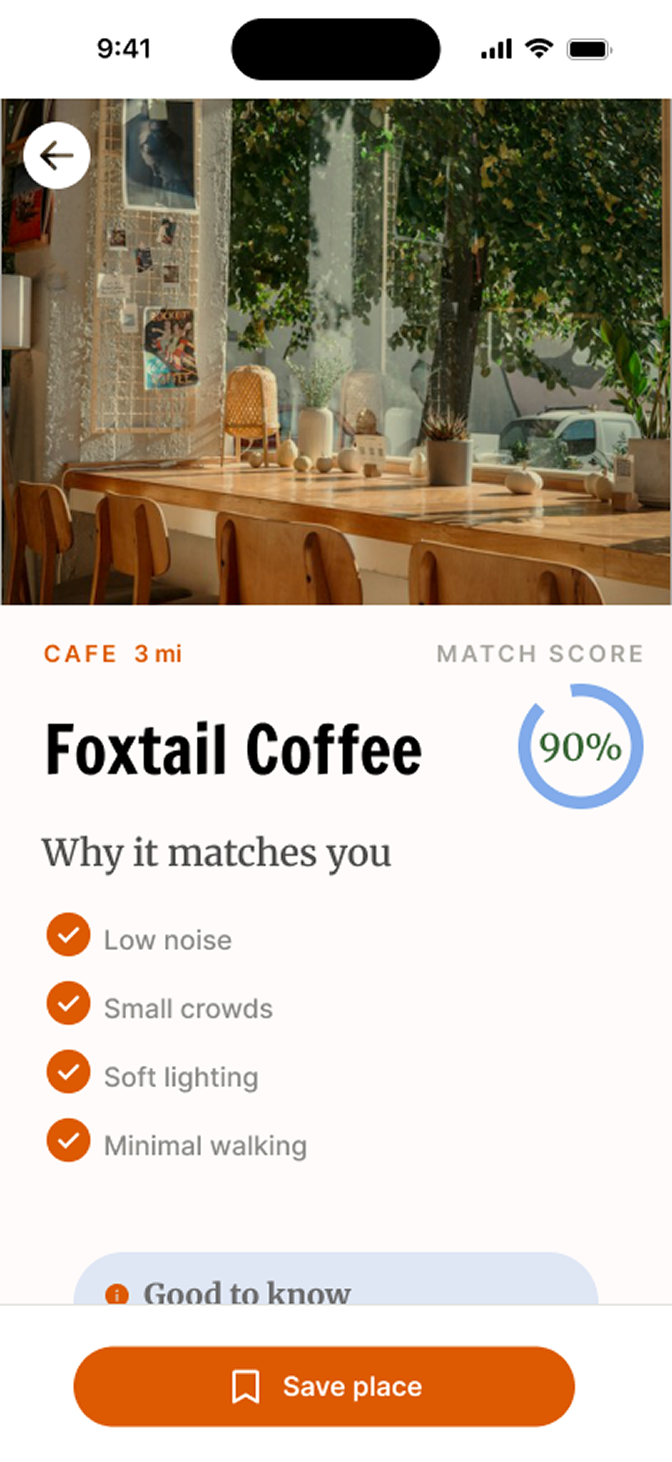
Discovery experience
Discover presents a map and personalized matches. Place details provide context for deciding whether a location fits the user’s needs.
Save and refine
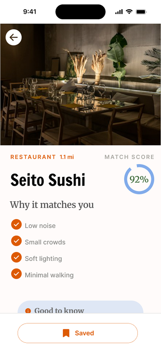
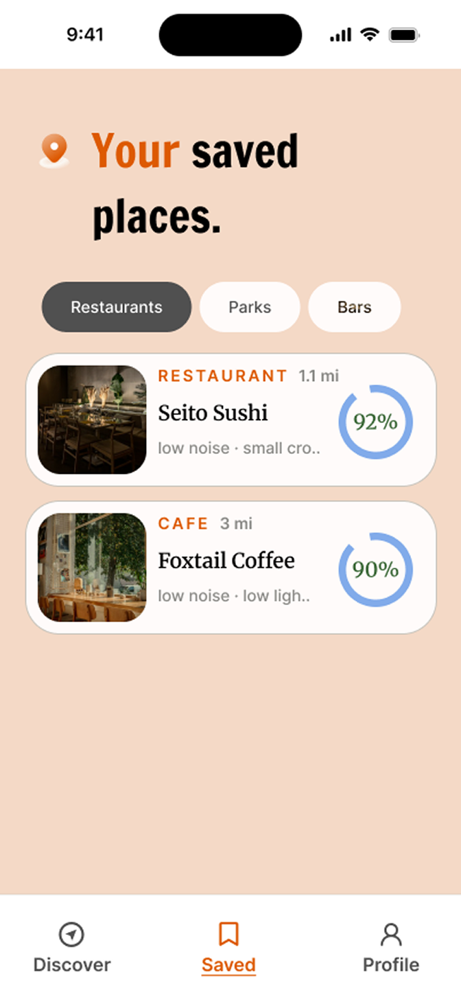
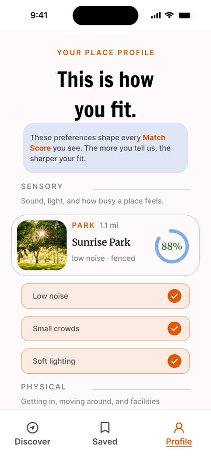
Experience notes
Saved places support returning to promising locations. The profile keeps preferences visible and available to refine as a person’s needs change.
08 / InPlace
Reflection
- What I learned
This project strengthened my ability to translate a conceptual idea into a cohesive visual direction. Exploring two distinct creative directions taught me to think more intentionally about how color, typography, and visual language shape a product's personality and influence how it's perceived.
- What I created
I developed InPlace from the brand identity through the interface, translating the selected creative direction into a cohesive iOS experience. The project brought together brand development, UI design, and motion through an interactive prototype.
- What I’d explore next
With more time, I'd focus on validating the experience with users, particularly how they interpret the personalized Match Score and whether the visual presentation communicates accessibility needs clearly. I'd also explore refining the motion and transitions to support usability rather than simply add visual interest.
Let's make something everyone can use.
I'm looking for my first full-time UX role, and I'm open to contract work. I'd love to hear about what you're building.
amydipre@gmail.com