
Modulo.
A sustainable furniture brand, across web and iOS.
Modulo is a sustainable furniture brand. I designed its website, mobile web experience, and iOS app, from refining the brand through a tested hi-fi prototype.
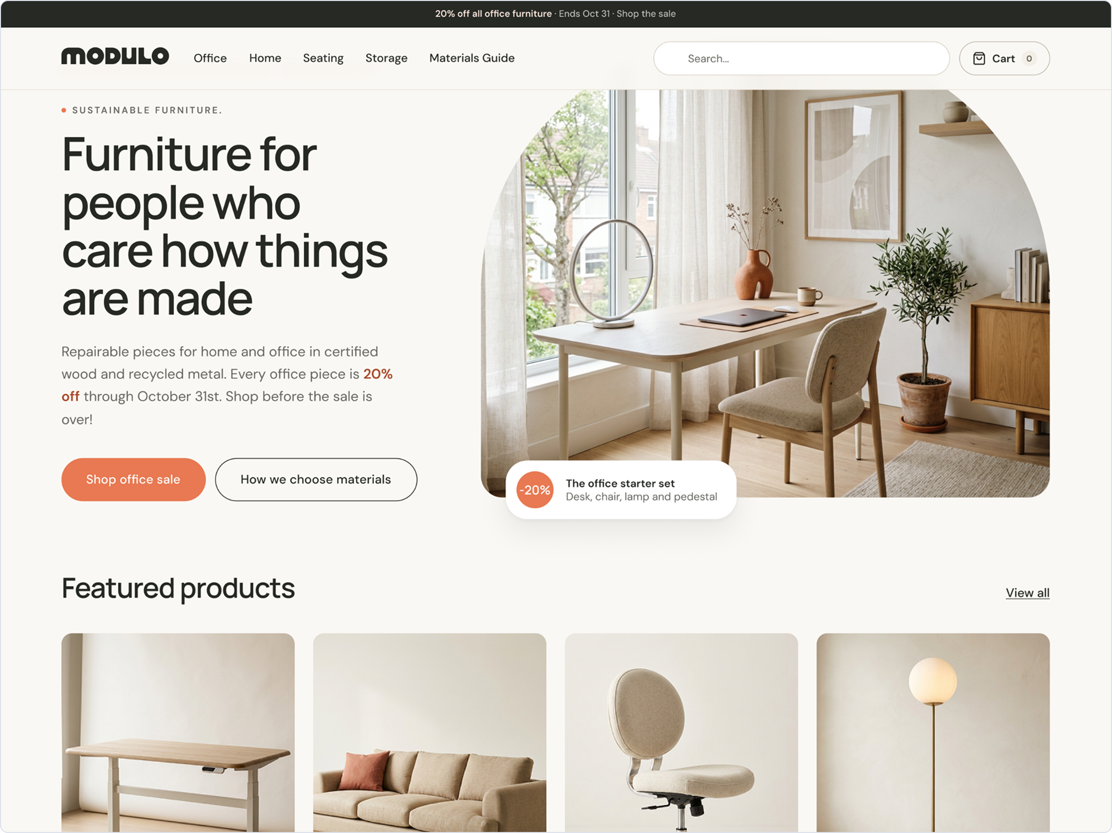
- My role
- UX/UI design and brand refinement
- Platforms
- Desktop web, mobile web, iOS
- Scope
- Brand refinement to tested hi-fi prototype
02 / Modulo
The goal
Make the brand feel coherent, wherever people meet it.
Design Brief
Modulo is a sustainable furniture brand. The brief was to take it from just a logo to a tested design: refine the brand, identify the main shoppers, research how people buy furniture online, and design a website, a mobile web experience, and an iOS app that work together.
The Goal
My goal was to help someone go from browsing to a confident purchase on any device. Furniture is a big purchase, so shoppers need to trust what they're buying before they commit.
03 / Modulo
Research
Methods and context
I interviewed 3 people who shop for furniture online. I also reviewed 3 similar products, noting what works, what shoppers complain about in reviews, and what's missing.
Findings
Modulo should make it easy to discover, evaluate, visualize, and trust to encourage buying.
Implications
Because of this, I put price, return details, and dimensions up front on product pages, and I added AR to the product detail page so shoppers can see a piece in their space."
04 / Modulo
Who I designed for
“I wish it was easier to understand the scale and overall feel of a piece. I’d love to see more real homes, different room settings, videos, and photos showing the furniture from different angles. Sometimes I need more than a pretty product photo to make a decision.”
Questions
Interview questions focused on what encourages users to browse a furniture brand's selection in the first place, what features keep them in the browsing process, what product details they want to see when considering an item, and what they need to feel confident enough to make a purchase.
Supporting evidence
Users expressed needing easy browsing options, data and features to help them visualize furniture in their space, and feeling confident about their choices before making a decision.
05 / Modulo
Mapping the experience
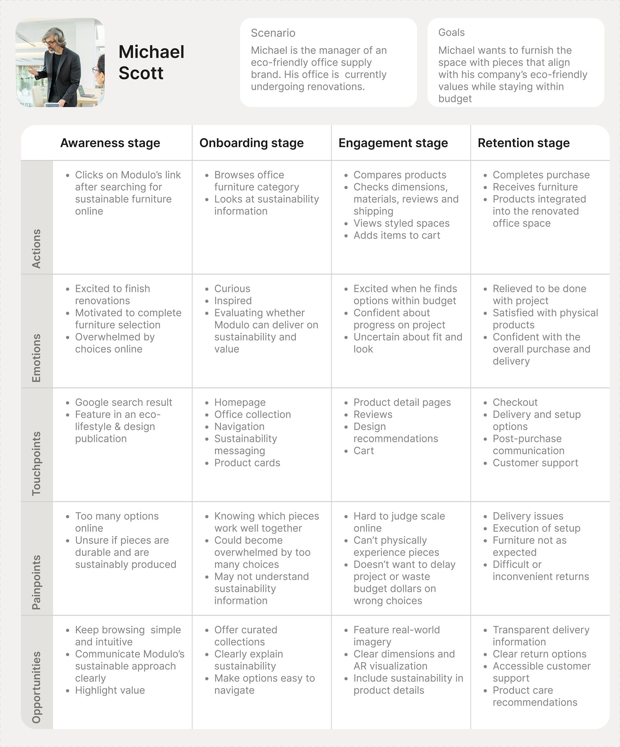
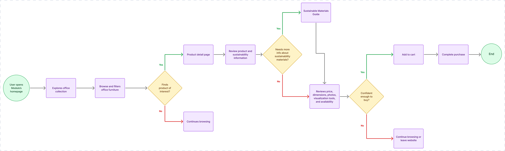
The task
Name the user's goal and the boundaries of this flow.
The friction
Complicated filtering options or browsing flow and insufficient sustainability or product detail would keep users from completing a purchase.
The opportunity
Build a layout intuitive for browsing, providing more detail at each step of the process leading up to product selection.
06 / Modulo
Key decisions
- Brand refinement
- I had only a typography logo and vague brand explanation for Modulo. I researched existing sustainable furniture brands to build the creative direction, keeping what already works in the sustainable furniture space and creating a unique brand identity from the data I already had.
- Web experience
- Detailed product pages keeping reviews, price, and dimensions high in the hierarchy, and added an AR feature to help users visualize pieces in their space.
- iOS experience
- I kept the iOS version consistent to the mobile web browsing experience in overall user flow, available details and AR feature on product pages, but replaced the web version's search bar with a search icon in the header. My rationale was informed by the layout of similar iOS furniture shopping experiences.
07 / Modulo
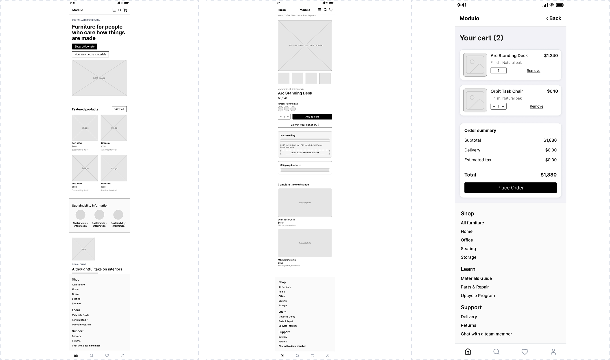
Lo-fi design
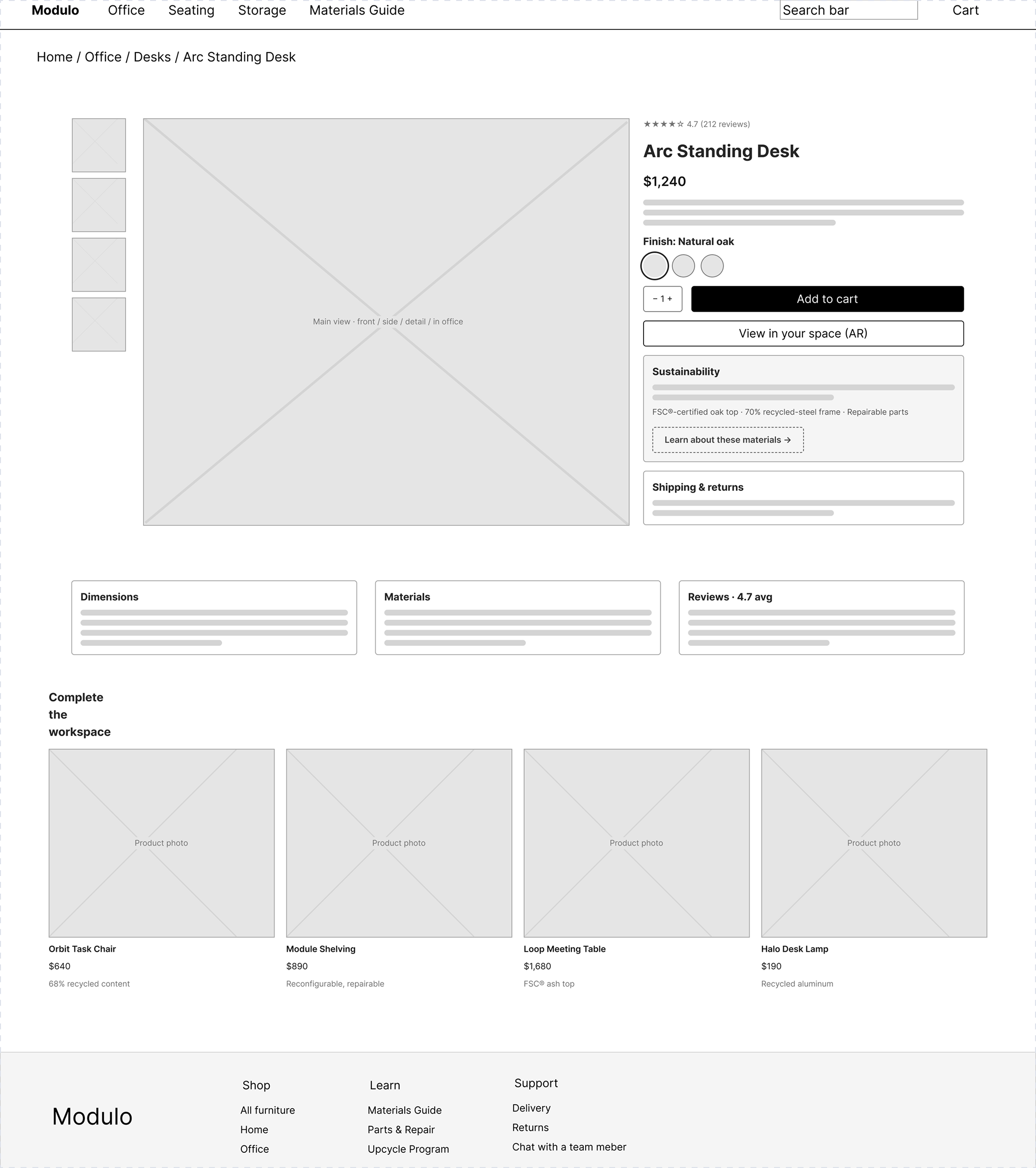
08 / Modulo
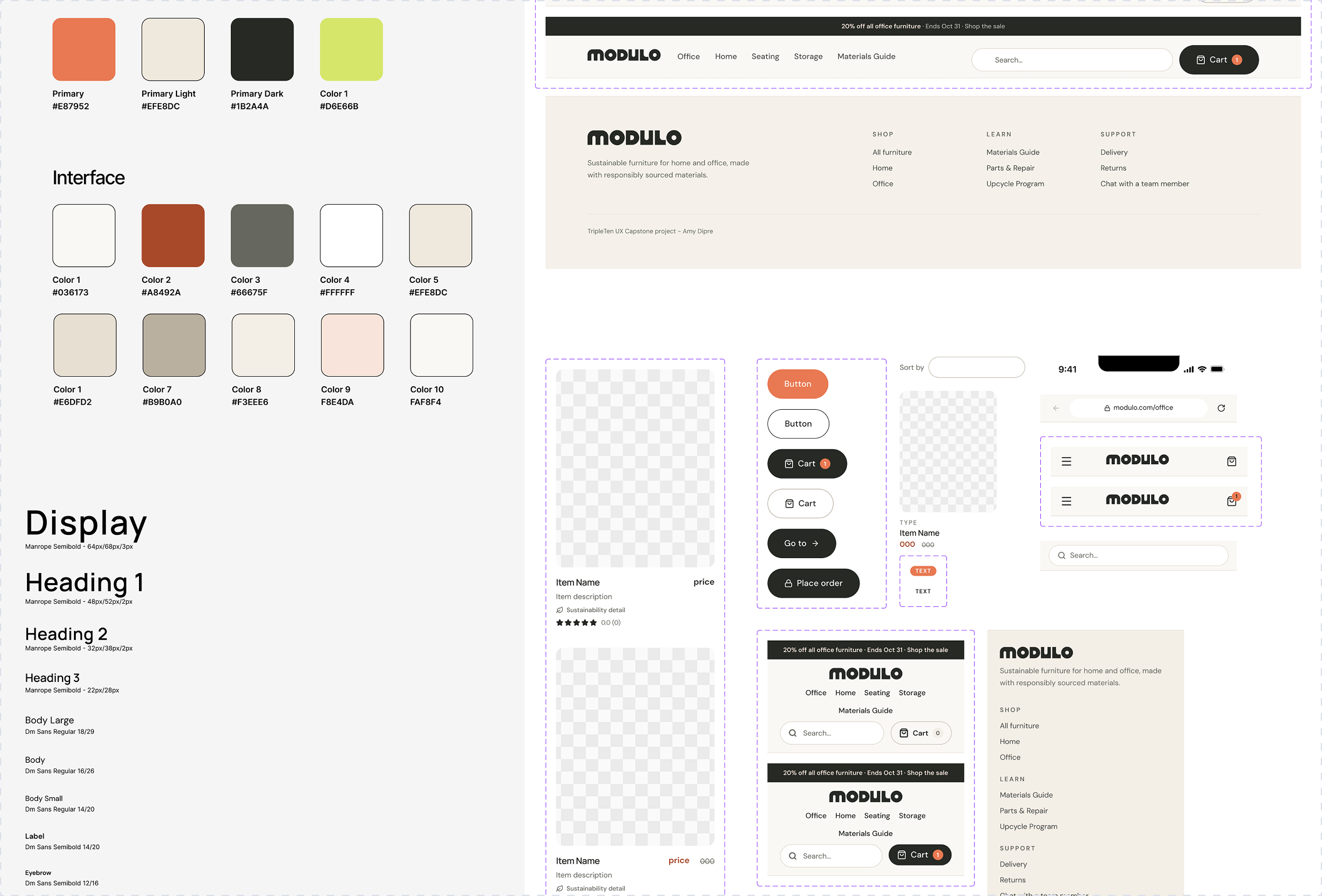
UI library
Visual language
Created a visual direction around the typography of the existing logo and brand's foundation of sustainability
- Earthy tones
- Groovy, 70's feel
09 / Modulo
Hi-fi prototype
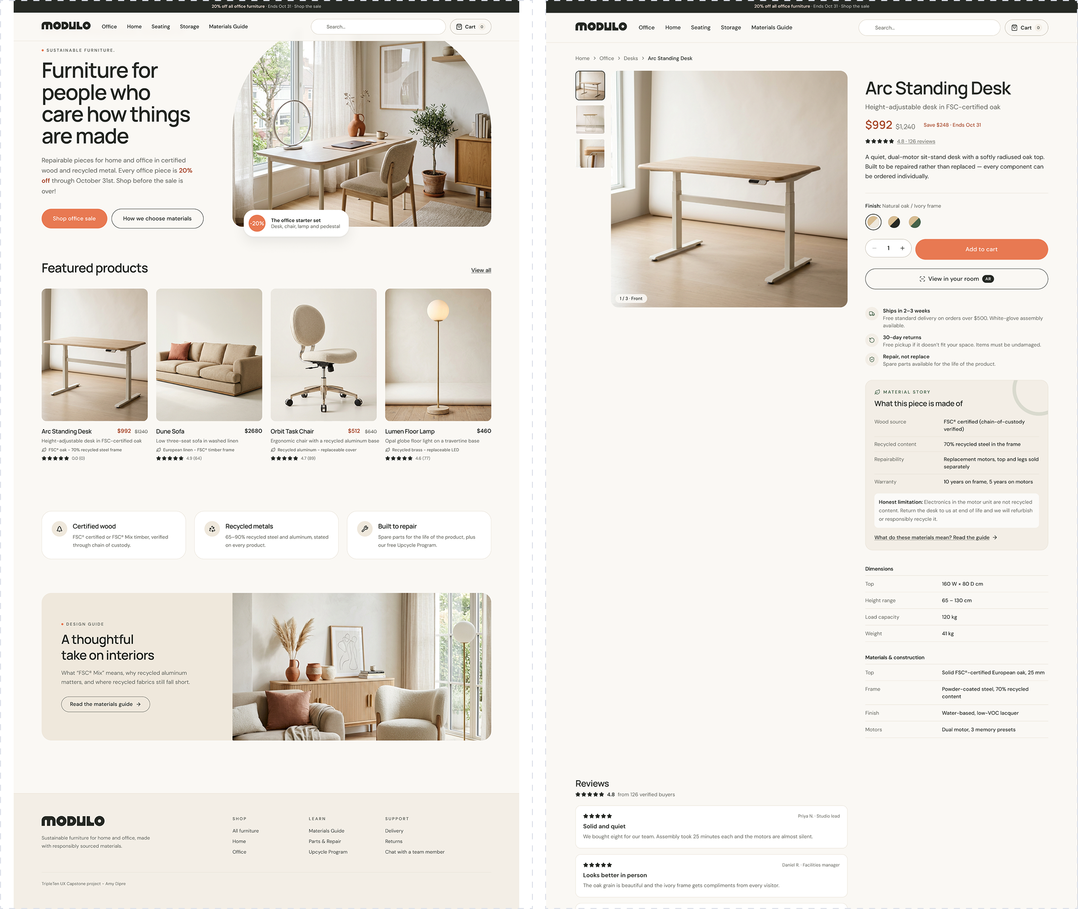
Desktop webpage
Experience notes
Users can filter for room or furniture type at the top of the page, or browse featured sale products with a CTA in the hero section.
Prototype link
Mobile webpage
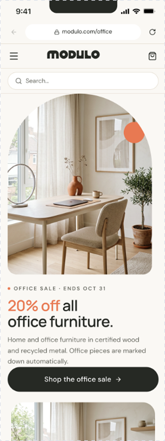
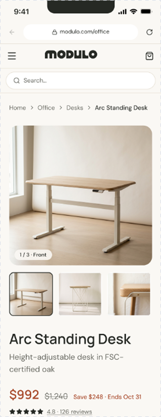
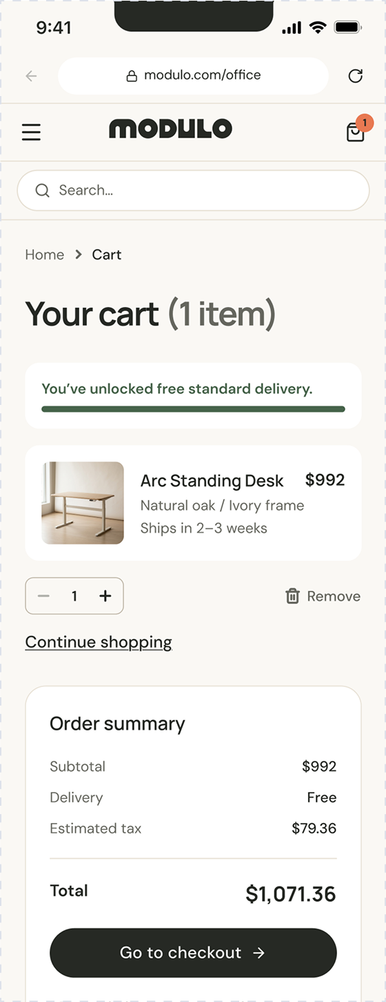
Responsive choices
Replaced filters with a menu icon in the header, left-aligned to facilitate easy navigation on user's device. I kept the same CTA at the top of the page.
Prototype link
iOS app
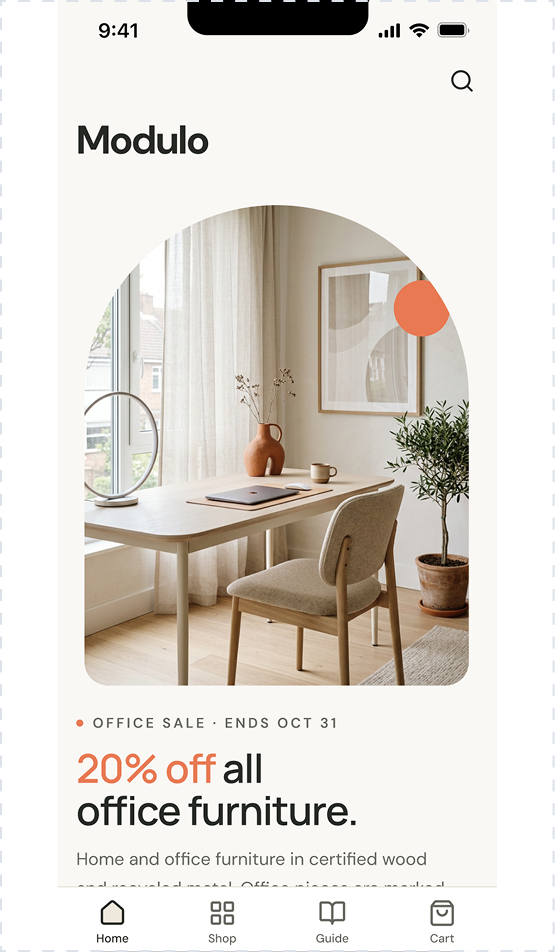
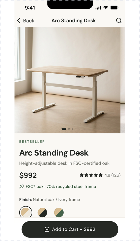
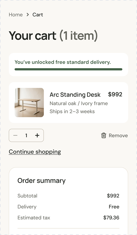
Native interaction notes
Kept the same layout from the mobile web version, but moved the menu and main interactions to the footer, and a static "Add to Cart" button on the product detail page
Prototype link - to add
10 / Modulo
Reflection
- What I learned
- Intuitive browsing and an uncomplicated layout keeps costumers browsing. During the checkout process, users need to feel confident in their decision. The better a customer can visualize a piece in their space, the more likely they are to reach the checkout process. The more a customer trusts the brand and overall experience while in the checkout process, the more likely they are to purchase.
- Web experience
- Product details should start out simple and be expanded as users go one step further in the shopping process. On product detail pages, reviews, dimensions, and an AR feature help customers visualize pieces in their space. On the cart and checkout pages, we build trust through secure transaction communication and return details.
- iOS experience
- I kept the iOS version consistent to the mobile web browsing experience in overall user flow, available details and AR feature on product pages, but replaced the web version's search bar with a search icon in the header. My rationale was informed by the layout of similar iOS furniture shopping experiences.
Let's make something everyone can use.
I'm looking for my first full-time UX role, and I'm open to contract work. I'd love to hear about what you're building.
amydipre@gmail.com