
NextUp.
Buy less. Swap more.
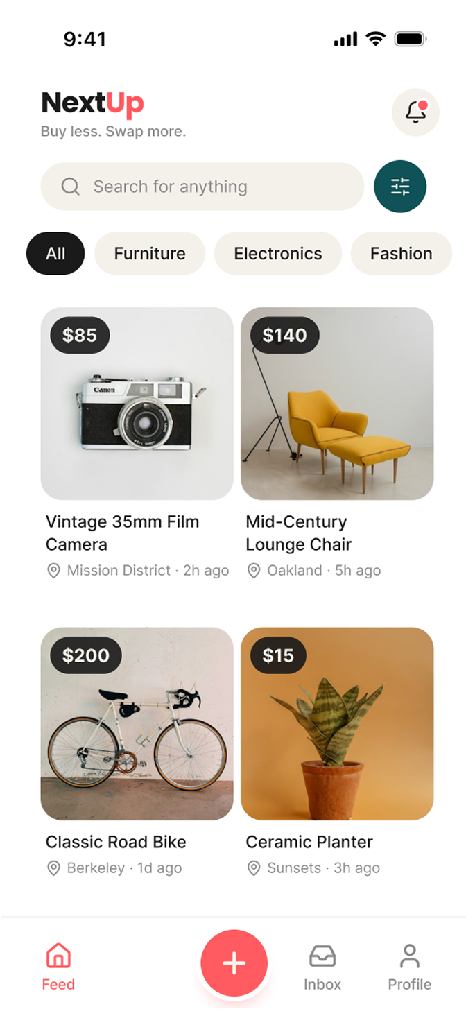
A secondhand marketplace concept shaped by competitive research and a reusable design system. I translated familiar browsing patterns into a distinct visual identity, shared components, and five high-fidelity mobile screens.
- My role
- UX/UI design, competitive research, brand identity, and design systems
- Platforms
- Mobile app — iOS patterns
- Project type
- Marketplace concept
03 / NextUp
Competitive research
I reviewed Facebook Marketplace and OfferUp to identify familiar marketplace patterns, then used Apple’s Human Interface Guidelines to inform the mobile layout. The research guided interface decisions rather than claims about user needs or measured outcomes.
- A familiar browsing pattern
- Facebook Marketplace and OfferUp both use a two-column grid with category filters near the top. I carried that pattern into the Feed so the interface starts from a recognizable way to browse secondhand listings.
- Mobile conventions, not guesswork
- Apple’s HIG informed the documented 44 × 44 pt tap-target goal, large-title headers on the main screens, back-arrow-plus-label navigation on detail screens, and safe-area padding.
- Keep the scope focused
- I considered letting people offer items instead of cash, but left trade and swap functionality out of this version to avoid expanding the scope. “Buy less. Swap more.” remains the brand tagline, not an implemented exchange feature.
04 / NextUp
Key decisions
- Familiar structure, distinct personality
- The Feed keeps the researched grid-and-filter structure. Coral accents, deep teal, rounded surfaces, and a Poppins/Inter type pairing give NextUp an energetic identity without reinventing basic navigation.
- A direct path to the seller
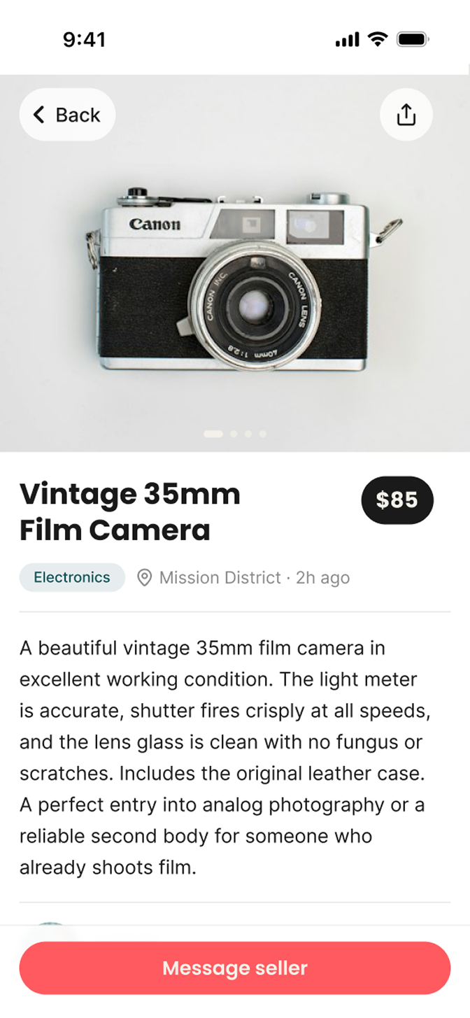
- The documented scenario is simple: search for a bike, open a promising listing, check its details, and message the seller. The final screens support browsing, evaluating an item, and continuing the conversation.
- Make related states inseparable
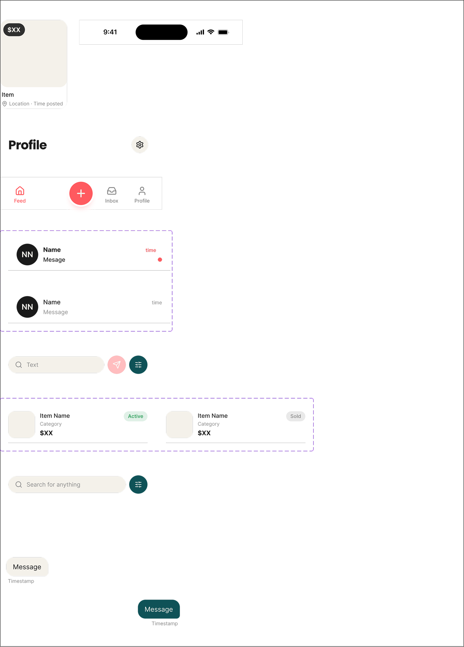
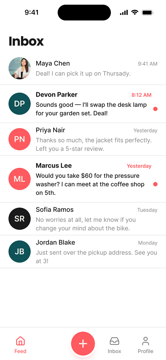
- For the message-list component, the unread dot and bold title are combined in a single variant. They communicate the same state, so the system keeps them together instead of allowing conflicting combinations.
05 / NextUp
Lo-fi foundations
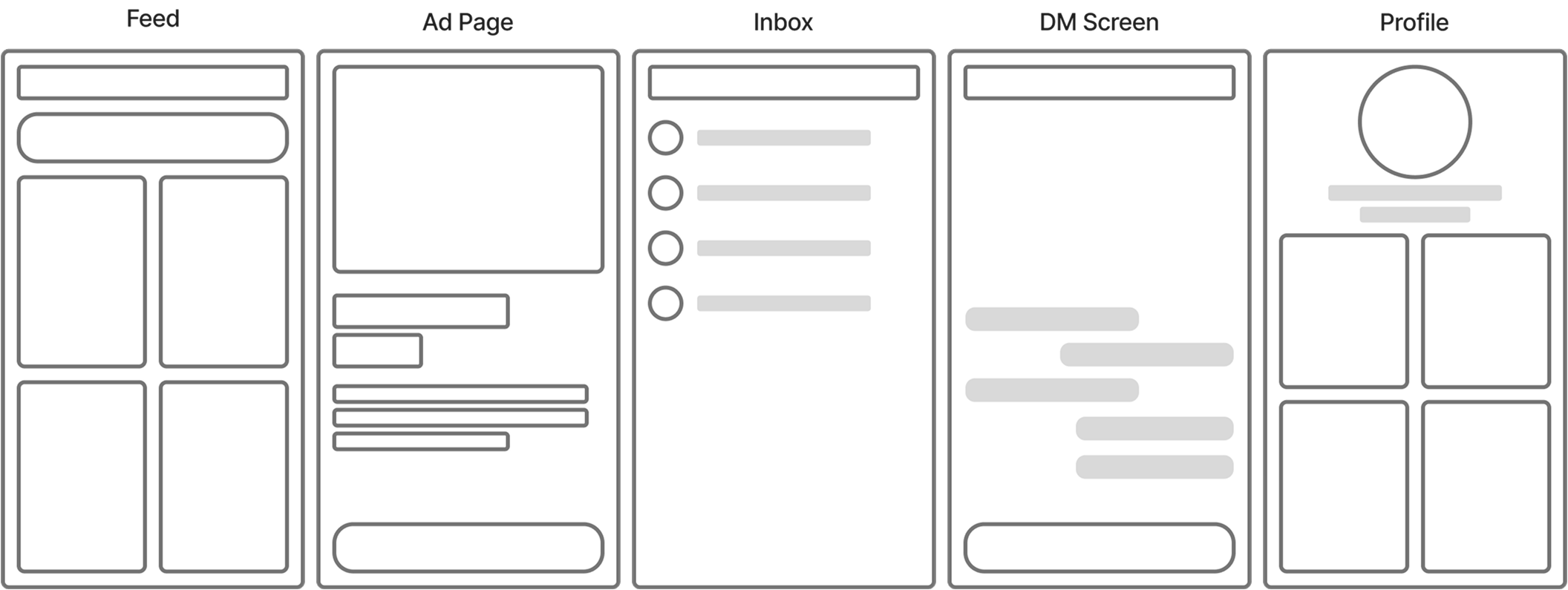
The low-fi layouts establish the main surfaces before visual styling: Feed, Ad Page, Inbox, DM Screen, and Profile. These wireframes show how browsing, listing details, conversations, and personal listings fit into one mobile app.
- Structure before styling
- The Feed uses a two-column listing grid; the Ad Page gives the item a large image and supporting details; Inbox and DM separate conversation browsing from messaging; Profile provides a home for personal listings.
06 / NextUp
Brand identity and design system
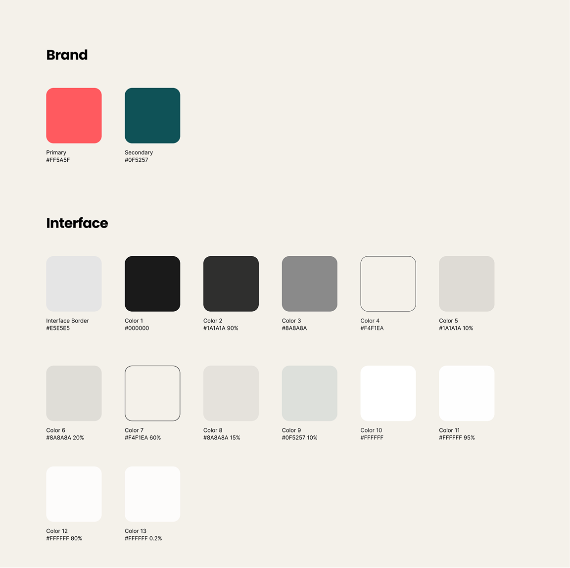
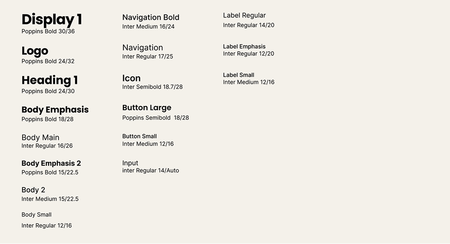
I built a compact design system around documented color and text styles and reusable interface components, then applied it across the final screens. The aim was consistency through shared rules rather than rebuilding each screen independently.
- An energetic marketplace brand
- NextUp refers both to an item’s next chapter and the person finding it. Coral adds energy, deep teal provides structure, and off-white surfaces soften the palette. I documented the palette in the color style guide and applied it across the final screens.
- Personality and readability
- Poppins gives headings and buttons a bold, geometric voice. Inter supports body copy, captions, listing descriptions, and messages, where longer reading needs clarity. Named text styles make these roles repeatable.
- Build once, implement consistently
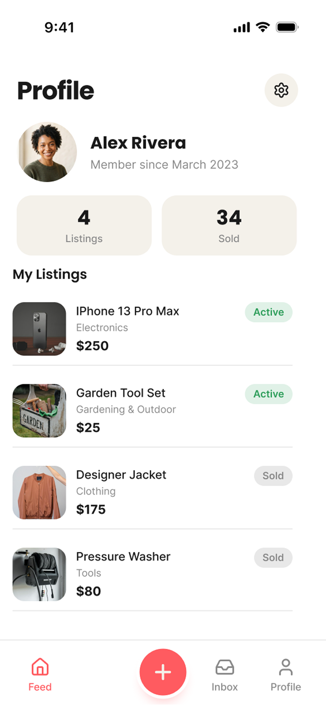
- The documented library includes buttons, item cards, a tab bar, and message bubbles. The same item-card component is used across Feed and Profile, while message-list variants keep unread emphasis and its status dot synchronized.
07 / NextUp
Hi-fi designs
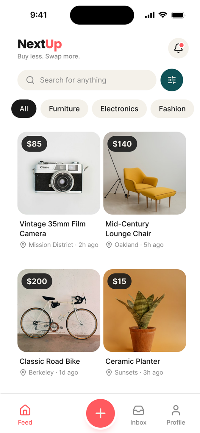
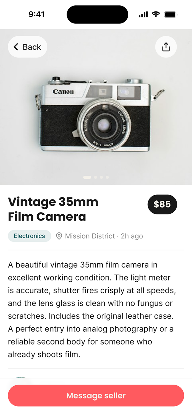
I applied the same color, type, and component system across five final screens for browsing, evaluating an item, messaging, and managing listings. Together, they show how the design system works across the core marketplace experience.
Feed
Item detail
Profile
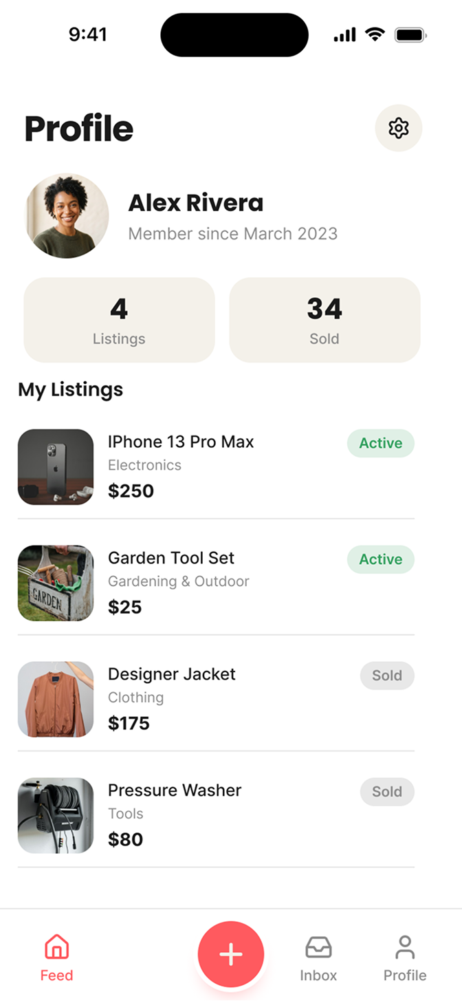
The Feed combines search, category filters, and a two-column card grid. Item detail brings the image, price, description, and seller contact action together. Profile uses the same visual language for personal listings and active or sold status.
Inbox
Direct message
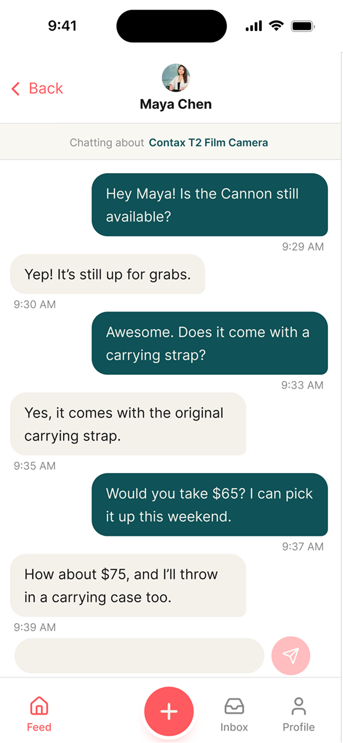
Inbox distinguishes unread conversations with paired emphasis and a status dot. The direct-message screen uses shared sent and received bubbles, keeping the conversation visually connected to the rest of the app.
08 / NextUp
Reflection
- What I practiced
- This project connected market research to implementation: learning from established marketplace patterns, interpreting mobile guidelines, and turning those decisions into a reusable system rather than a collection of isolated screens.
- What I created
- A NextUp brand identity, documented color and text styles, reusable components and states, five low-fi layouts, and five high-fidelity mobile screens. Together, they show how shared rules carry through an interface.
- What I learned
- The documented process reinforced three lessons: recognizable patterns give a layout a useful starting point, platform guidance makes decisions more concrete, and linked component states can prevent inconsistent combinations. Keeping trade and swap out also kept this version focused.
Let's make something everyone can use.
I'm looking for my first full-time UX role, and I'm open to contract work. I'd love to hear about what you're building.
amydipre@gmail.com